Project — 01

Bluestat POS

Rebuilding a multi-branch point-of-sale platform around the people who actually use it at the counter.

Role
UX/UI Designer
Scope
UX Research, UX Strategy,
UI Design, Usability Improvement
Platform
POS
Overview

Designing a
People-First POS

Bluestat is a point-of-sale system used daily by business owners and frontline staff — people with very different levels of technical confidence, all moving fast on a busy counter.

Over time the product had grown complex enough that everyday tasks generated a stream of support tickets, onboarding dragged on, and the team leaned on customer support to keep stores running. My goal was to make the system something users could operate confidently on their own.

The problem

Where users were getting stuck

From issues users reported through the LINE Official Account, four sources of friction kept surfacing.

LINE OA reports — sample month
What users wrote in about
Finding menus to manage products42%
Onboarding & setup help27%
Checkout & payments19%
Other12%
  • Frequent support requests for basic POS operationsEveryday tasks generated a steady stream of help tickets that should have been self-service.
  • Complex interface that required training to use effectivelyStaff couldn't get productive without hands-on instruction first.
  • Long onboarding process for new customersSetup dragged on and leaned heavily on the support team to finish.
  • Store owners lacked visibility and control when away from the POSManaging a store meant being physically at the counter.
Source Issues users reported directly through the LINE Official Account.
Research & insights

Reading the signals

Working from what users reported and how they actually moved through the system, I grouped the recurring issues into a few clear usability themes — each pointing to a specific moment where the interface was working against the user.

70%
of reported issues were basic, self-service tasks
Three recurring themes
Low feature discoverabilityUsers wrote in for actions that should be self-service — menus, products, promotions.
Onboarding needed assistanceMany couldn’t finish setup on their own, so launch stalled waiting on support.
Checkout slowed transactionsA multi-step payment flow dragged during busy periods at the counter.
~4 wks typical onboarding time before the redesign
Design goal

Make core flows simple enough for users to finish on their own — no support needed.

The solution — design philosophy

From dependency
to confidence

Most POS tools assume you already know the system.
We flipped that — the product teaches as you use it.

Principle 01

Teach in context

Guidance appears right where the task happens — no manual, no training needed.

Principle 02

Everything within reach

Every section stays visible in a persistent sidebar — nothing hides behind a menu.

Principle 03

Forgiving by default

Every action can be reviewed or undone — one wrong tap never ruins a sale.

Before & after

Two decisions, grounded in UX principles

The changes that did the most to speed up the counter — and the reasoning behind each.

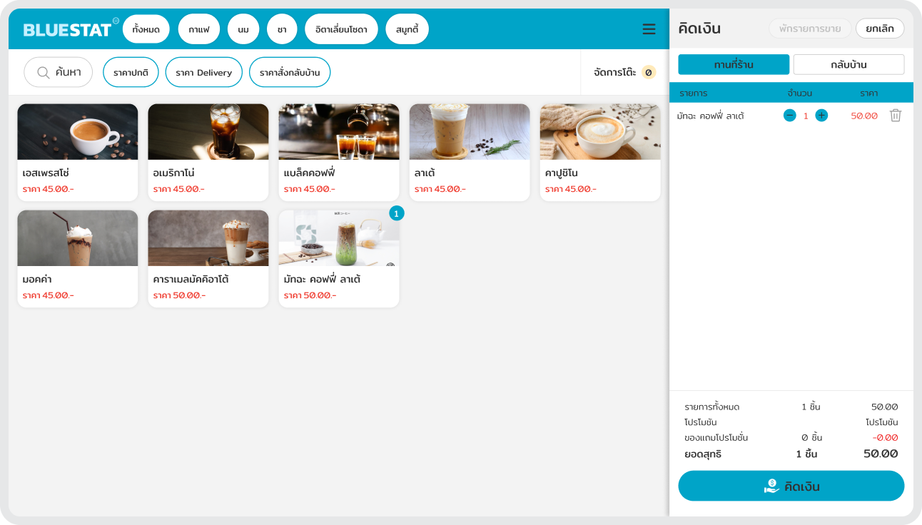
Before Before — hamburger menu
After After — persistent sidebar
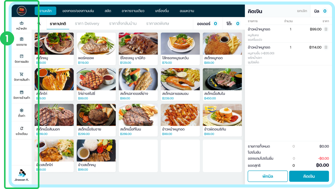
01 · Navigation redesign

Persistent sidebar, not a hamburger

Design decision — Replaced the hamburger menu with a persistent sidebar navigation to surface primary actions.

Reasoning — Making key options visible reduces search effort and cognitive load, aligning with Hick's Law, and enables faster access to frequently used features.

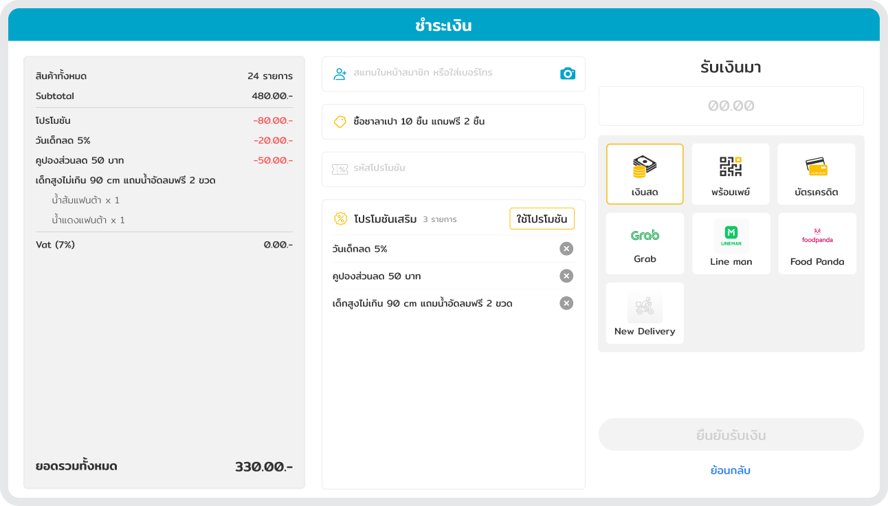
Before Before — multi-step payment
After After — sliding payment panel
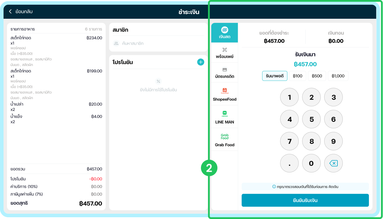
02 · Checkout payment layout

Amount input front and centre

Design decision — Moved payment options into a sliding sidebar panel to prioritize the amount input and primary action.

Reasoning — This improves visual hierarchy and accessibility to the main action, supporting Fitts's Law, while reducing decision complexity in line with Hick's Law.

Onboarding flow

Getting a store live,
on its own

The setup journey that used to stall waiting on support — rebuilt as a guided, self-service path from first launch to a working till.

BEFORE1–3 days
Support-led setup
  • 1Contact support to open a store
  • 2Wait in queue for an appointment
  • 3Staff installs the system remotely
  • 4All setup depends on staff
AFTER~30 min
Self-service onboarding
  • 1Sign up online in minutes
  • 2Activation code arrives by email
  • 3The app guides every setup step
  • 4Store is ready to sell the same day
First time
Term & Condition
Input Activation Code
List Staff
Input PIN
Check PIN
Information Onboarding
Shop Info & Staff
Mainpage
Accept
Refuse
Select
Invalid
Pass
Edit
Next / Skip
Structure & system

The design system I built

An FC Iconic type scale, a clean cyan palette with a warm accent, and a reusable component set that kept every screen consistent.

Color · brand & neutrals

brand/900
#00293B
brand/500
#009EC0
brand/400
#22BDC8
brand/50
#F2FBFF
ink/900
#111111
ink/400
#ADABAA
ink/600
#787676
neutral/100
#EFF2F3

Type scale · FC Iconic · 1.25

display / 49 · 700Aa
heading / 31 · 700Heading
title / 20 · 600Section title
body / 16 · 400Body text — the default for reading.
caption / 12 · monoCAPTION / META LABEL
Design highlight

Selected screens

Tap through the key screens of the redesigned product.

Swipe to change screen
Sale & Checkout

A product grid with a persistent sidebar and a sliding payment panel that keeps the amount input and primary action front and centre, even during a rush.

Results & impact

A faster, more
self-service product

−60%
Fewer support tickets for basic, everyday tasks
−35%
Shorter average checkout time at the counter
 Faster onboarding
New merchants get set up on their own
 Shipped to production
Launched and adopted across stores
Tools & technologies
Figma FigJam Photoshop Illustrator Manus Lovable ChatGPT
Reflection

What I'd carry forward

Looking back, what held up — and what I'd approach differently next time.

What worked

Letting support data lead

Grounding the redesign in real user reports kept the team focused on friction that actually cost merchants time, rather than features we assumed they wanted.

What I'd do differently

Test before, not just after

I'd run lightweight usability sessions earlier — on wireframes — instead of validating mostly at the end. Catching the navigation confusion sooner would have saved a full design iteration.

Next project

Prochang Partner →

View project